YEAR: 2023-2024
UX CASE STUDY
Flytoget terminal
Enhancing information flow at Oslo S to create a seamless travel experience.
The Geopard project, as its name suggests, was delivered at a fast pace. It involved collaboration with Interior Architects, on-floor customer service, and simultaneous projects featuring new ticket channels.
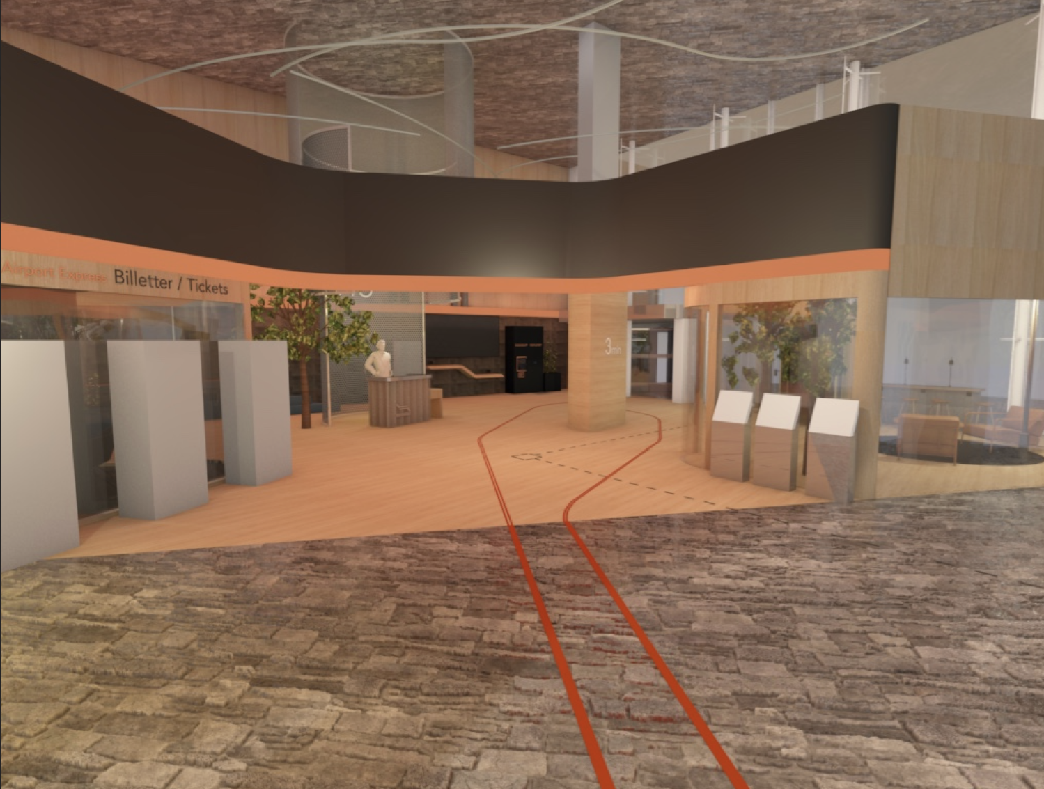
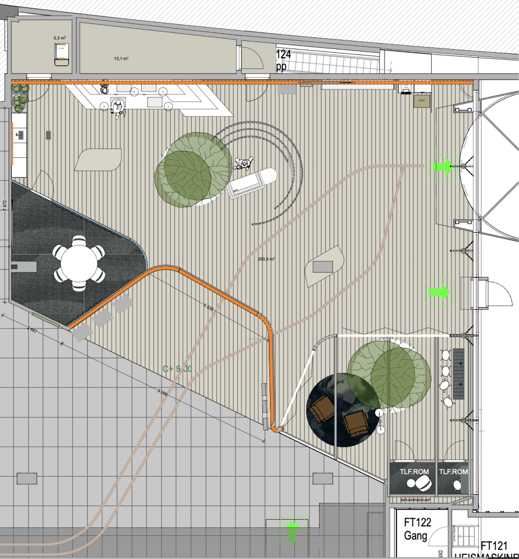
At Oslo Central Station, we aimed to renovate our terminal and enhance the traveler flow. I was responsible for managing the large display above the terminal entrance, which would exclusively show Flytoget departures. Additionally, we installed two pillar screens inside the terminal and introduced a horizontal screen to display flight departures from Oslo Airport. This project, involving multiple departments, had a deadline of May 1, 2024.
The key user groups
Flytoget passengers
Travelers departing for the Oslo Airport from Oslo Central.
Gains: Natural and stress-free transition to the airport.
Pains: Unclear where the Airport Express departs.
Needs: clear flow, visible departure screens.
On-floor customer service
Help FT customers to achieve a stress-free journey.
Gains: A terminal that considers their workspace.
Pains: Other info channels lack the trust like human help.
Needs: Automate customers to reduce their workload.
The vision
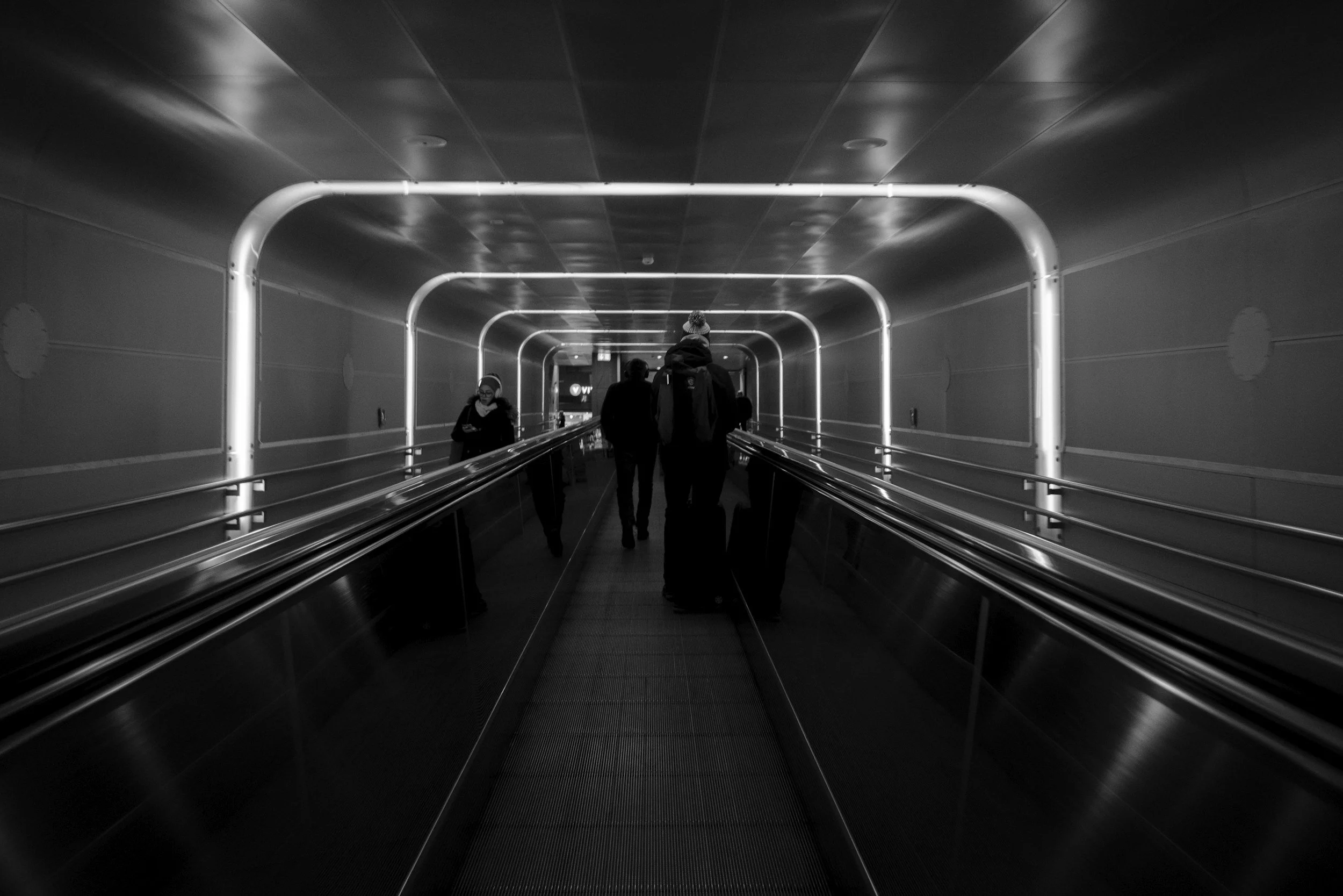
Flow - The flow from the entryway to the airport express train is essential. The Trains will have departures with a 10minute interval, and will therefore have constant flow with travelers; and little to no waiting groups of passengers.
Ticket channels - We have three ticket sale options in the terminal: ticket-machine, card validators and the terminal crew on-floor. Customers should have a clear view of the sale options to plan their own journey.
Visible departures - Screens both outside and inside the terminal will provide with the departure time for the airport express exclusively. During disruptions the information should be given as quickly as possible. However, the minutes counting down to departure should give the message of availability, not stress. (I will be in charge of visible departures in this project)
main display:
Attract Flytoget customers into the terminal arriving from the taxi area and escalators on the left.
Clearly show two departures at a time. Similar to the main hall, customers will stop in front of the departure screen to check relevant departures. Therefore, limiting it to two departures at a time simplifies readability.
Provide alternative solutions in case of train disruptions.
pillar screens
They will be visible to passengers walking past or sitting in the terminal. If crowds gather in front of them, it could disrupt passenger flow.
Allow station crew (SKV) to monitor what the main display shows.
Potentially serving as a meeting point for taxi replacements in the future.
Indicate the departure track, especially for distant tracks (e.g., 13/14).
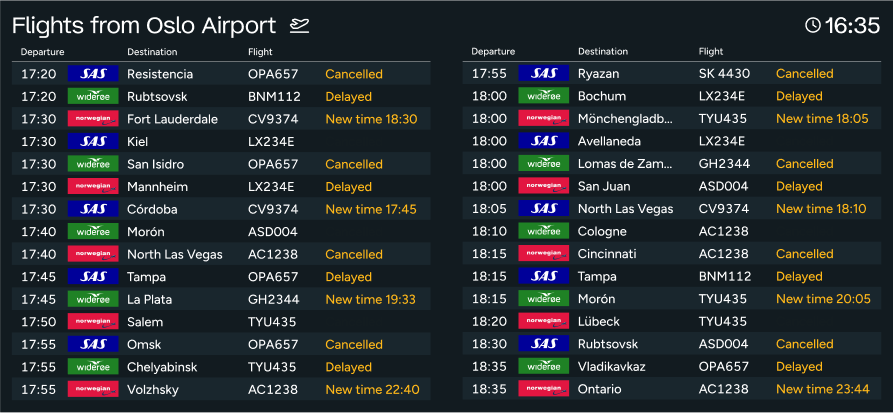
Horizontal screen
Show flight departures within a 2-hour window, starting 30 minutes ahead, to assist Flytoget travelers.
Indicate disruptions when necessary.
Ensure clarity and familiarity by resembling an airport screen and following user reading patterns (time → airline logo → destination).
Enhance readability with clear separation between lines, using spacing or alternating background colors.
Main screen
-
![]()
First version
With only the essential like two departures, track and logo. This gave a clean slate to discover designs.
-
![]()
Ver.2
Like an IPhone, the departures are displayed like notificaitons. moving upwards to show the upcoming departure.
Though this design was not matching the Flytoget design system.
-
![]()
Ver.3
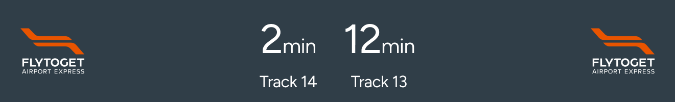
Taking inspiration from #Ruter who show the upcoming departure with minutes, and other departures like a clock.
Having two types of time designs made it hard to separate the departures. Travelers then misunderstood the message as “10 minutes until 12:40”.
-
![]()
Ver.4
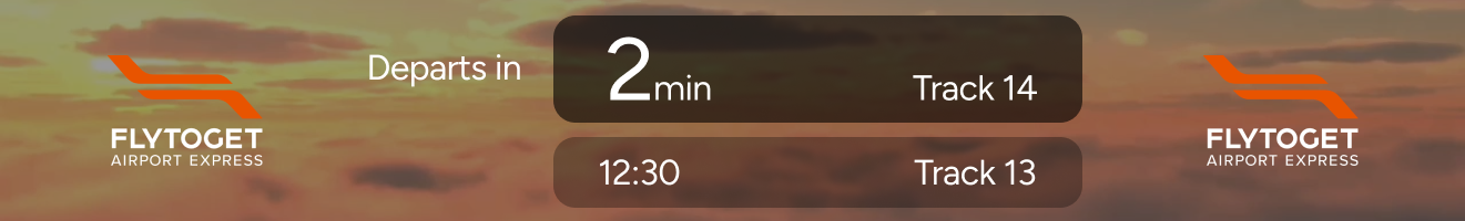
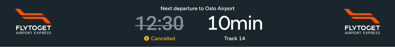
We identified a potential design but needed a better way to show train disruptions. Using a clock design for cancellations highlighted the affected departures.
We took inspiration from the Flytoget app, where gray shows a disabled function and yellow indicates an error. It was essential to use more than colors and icons to convey disruptions, considering the various cultures and languages of travelers.
-
![]()
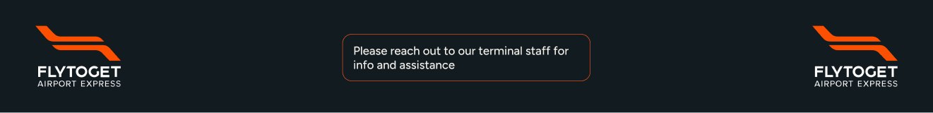
Ver.5
We know from experience that the screens can fail, and needed a Killswitch for such situations. Instead of a simple black screen, we added a message to contact our trusted terminal staff on-floor.
-
![]()
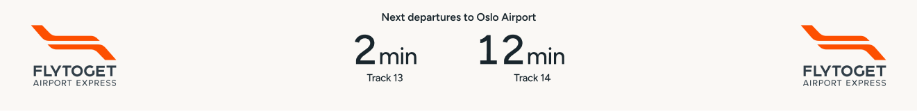
Ver.6
Minor tweaks were added such as text sizes and make the minutes in a monospace uppercase to ensure little movement in layout.
-
![]()
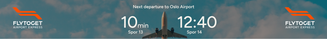
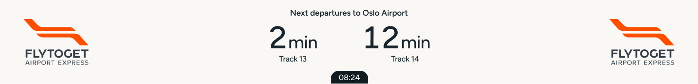
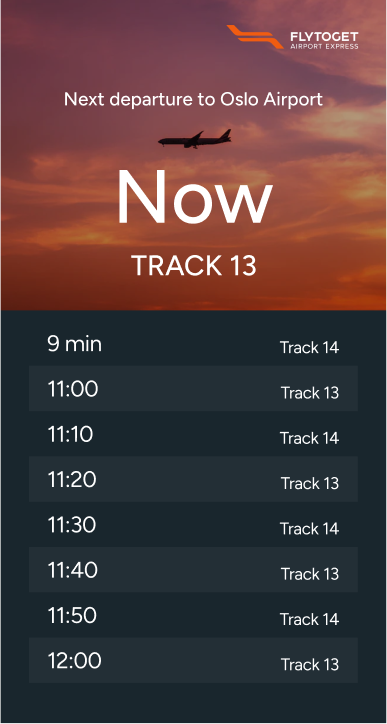
Final version
This is the final version where we added a clock on the bottom to make sure the departure screen was up to date. and passengers could more easily plan their own journey with the information given.
Pillar screens
-
![]()
Ver.1
Because of the planned 2-meter screen, we opted to show more departures inside the terminal.
-
![]()
Ver.2
Like on the main screen, the upcoming departures should be highlighted in size.
-
![]()
Ver.3
Trying to match the design to the previous IPhone inspired design on the main screen.
-
![]()
Ver.4
The screen got smaller because of budget cuts. We therefore changed the amount of departures to two.
-
![]()
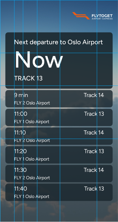
Ver.5
The Final design is a direct copy-paste of components from the main screen. Just to keep the red thread in the journey.
Horizontal screen
-
![]()
Ver.1
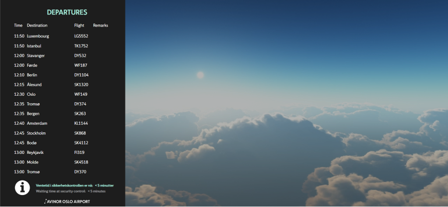
Together with the API from Avinor (the airport), we could get an idea of what values we could work with.
It was in this early process where we didnt know how many departures we wanted to show that would benefit the traveler. The screen on the right will be for other information or commercials.
-
![]()
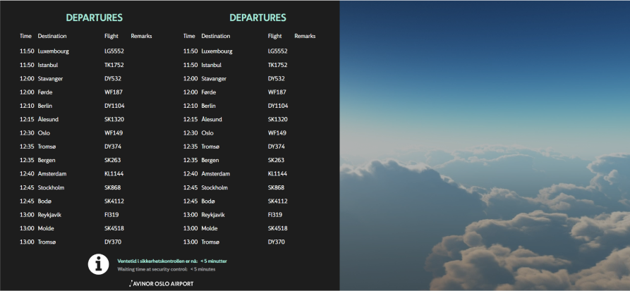
Ver.2
We added a second column with departures to see how much space we would use.
Feedback from travelers here were mixed because it didnt look like a flight departure screen, and the rows were hard to differentiate.
-
![]()
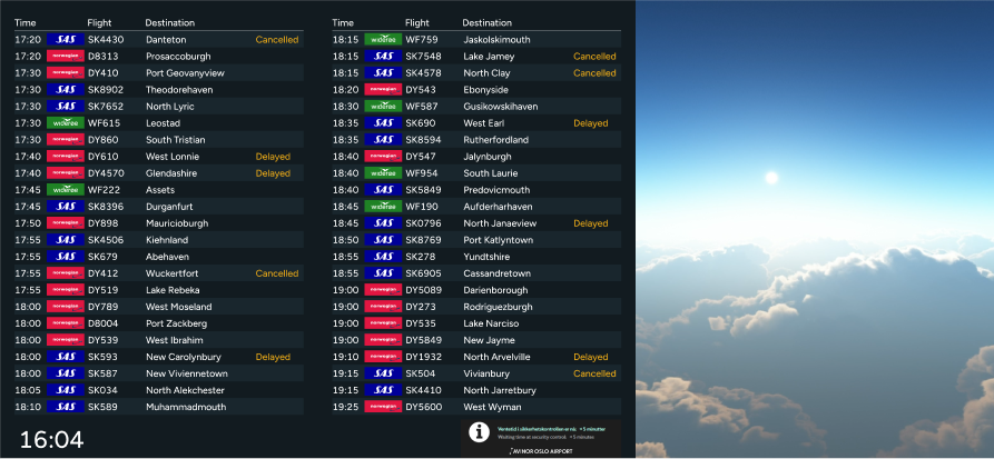
Ver.3
Taking inspiration from the standard flight departure screens on airports, the design looked more recognizable. There was also a significant increase of space for more departures.
Adding a gray background to every other line improved the design, making it easier to read. This change was inspired by lists for people with dyslexia.
-
![]()
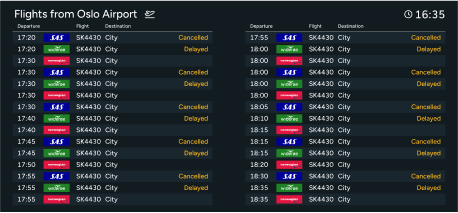
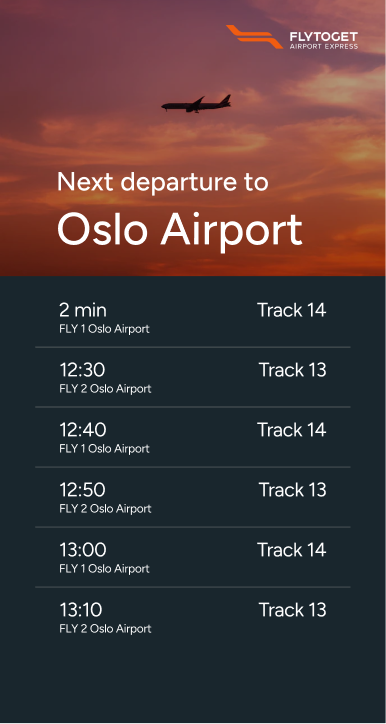
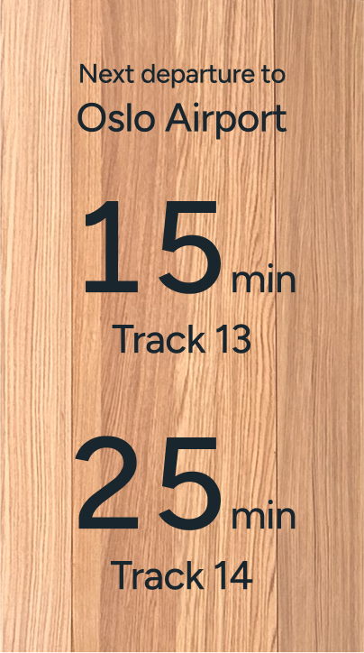
Ver.4
We removed commercials and unrelated info next to flight departures because they were distracting. We also made the text larger for better readability.
-
![]()
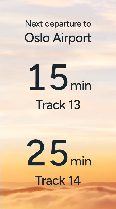
Ver.5
The final design adjusted the order of values. Travellers interviewed prioritise time and city first but check the logo and flight number afterward. Placing the logo between time and city creates space between the values.